< see more UX/UI Design
Boxpark Sushi
Boxpark Sushi is an innovative restaurant that merges advanced technology with the option for consumers to customize their Asian cuisine. Targeted towards tech-savvy millennials, Boxpark Sushi aims to create a space where customers can truly feel at home while enjoying a personalized dining experience.
Market Research
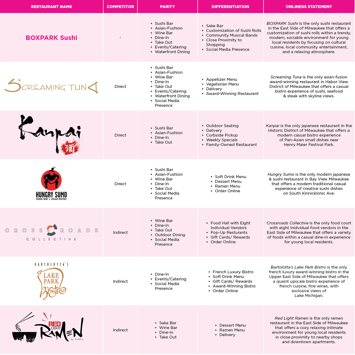
In developing the brand for Boxpark Sushi, we faced the challenge of standing out in a saturated market of Asian cuisine targeting millennials. By conducting thorough research on both direct and indirect competitors, we were able to identify key similarities and differences among various restaurants. This analysis highlighted areas where Boxpark Sushi could differentiate itself.
The insights gained from competitor analysis revealed that millennials prioritize innovative communication around food and its presentation. Armed with this knowledge, we focused on integrating technology and customization into the dining experience. This allowed us to create a unique offering where customers could craft their own culinary creations, setting Boxpark Sushi apart from its competitors and appealing directly to the preferences of our target demographic.
Brand Identity
Logo Ideation Sketches
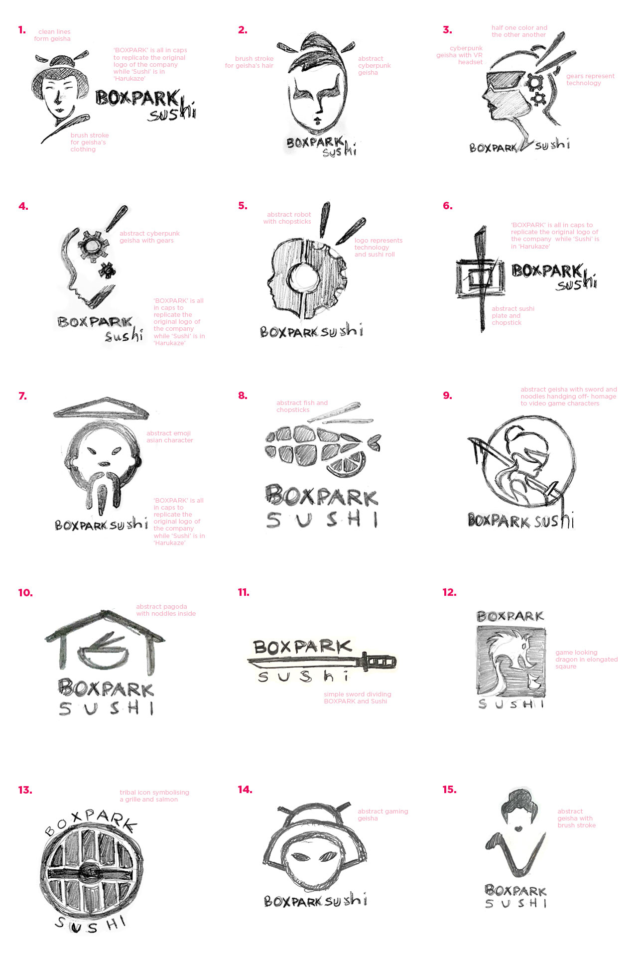
After identifying a clear differentiation for Boxpark Sushi, the next crucial step was to develop a logo and brand identity that encapsulated the brand’s essence. I began by creating a series of ideation sketches aimed at conveying the themes of technology, customization, and cuisine.
Many of the initial sketches featured concepts like “gears in motion,” symbolizing innovation and the creative process involved in customizing dishes. Additionally, I explored designs that included geisha elements to pay homage to the cultural roots of the cuisine offered at Boxpark Sushi.
The goal was to craft a logo and identity that not only represented the brand’s commitment to innovation and technology but also resonated with the young millennial audience. This thoughtful approach ensured that the branding would effectively communicate the unique dining experience Boxpark Sushi aimed to provide.
Digitization & Rendering
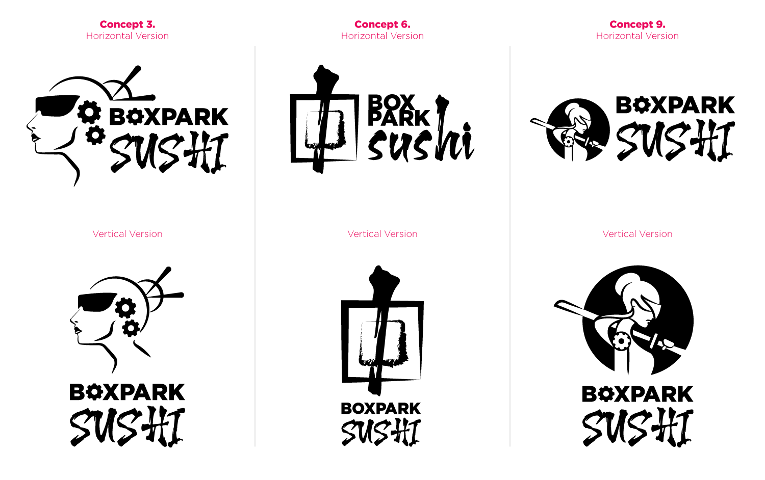
After an extensive sketching process, three final icons were selected that best represented the essence of Boxpark Sushi. These icons were chosen for their ability to convey the themes of technology and innovation at the core of the brand. Each design reflects a unique aspect of the dining experience, seamlessly blending modern elements with cultural references.
These distinguished icons not only enhance the visual identity of Boxpark Sushi but also resonate with the tech-savvy millennial audience, reinforcing the restaurant’s commitment to customization and a contemporary dining experience. This strategic selection was crucial in establishing a memorable brand that stands out in a competitive market.
Final Logo Design
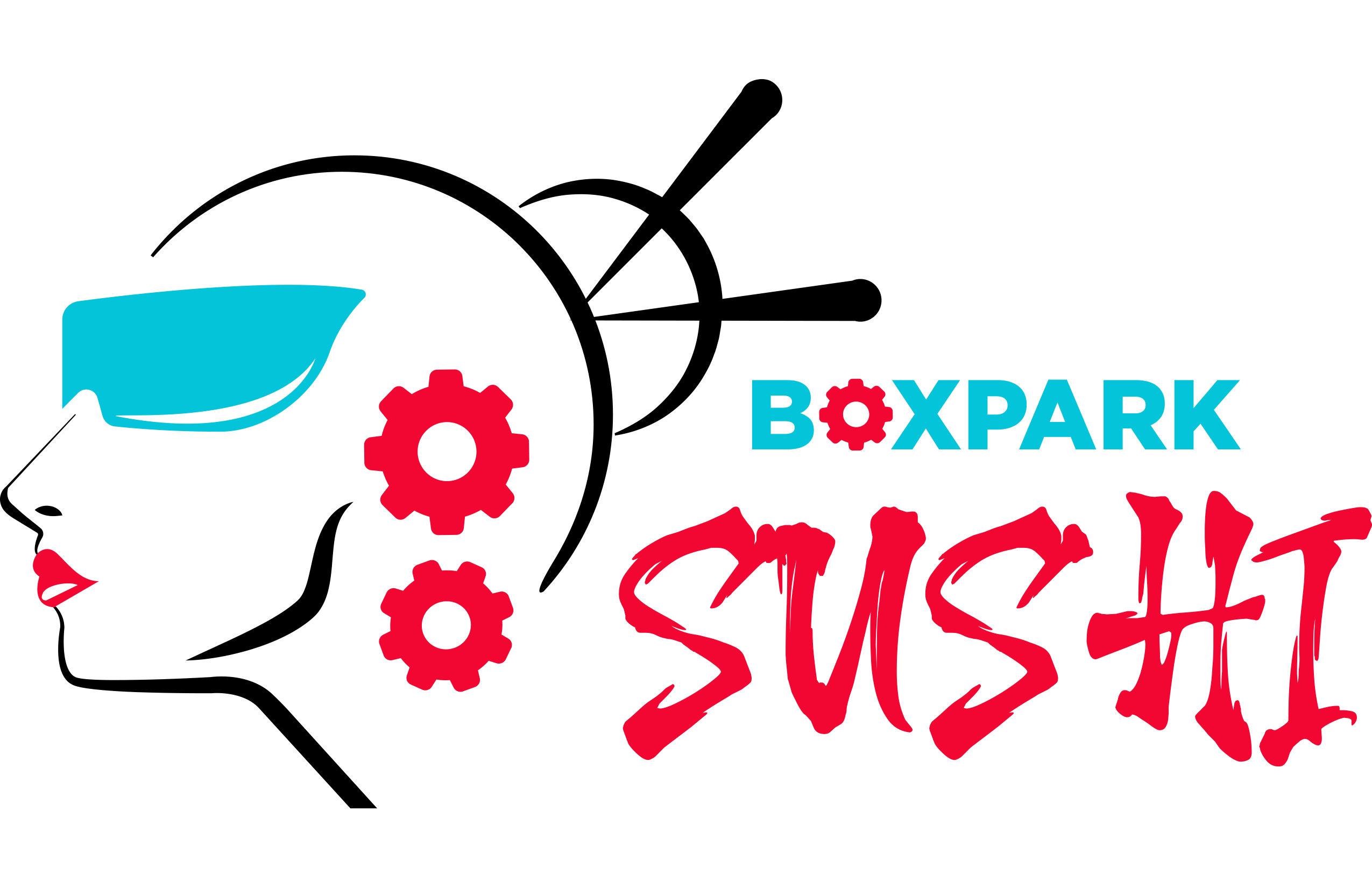
The final logo design for Boxpark Sushi is an abstract cyber geisha, effectively embodying the restaurant’s innovative concept. Incorporating elements like gears in the head and a VR headset, the logo tells the story of a sushi restaurant that merges technology with cuisine.
This design not only differentiates Boxpark Sushi from its competitors but also resonates with its target demographic of young, tech-savvy millennials. The use of vibrant colors enhances its appeal, creating a futuristic icon that invites curiosity and excitement. This thoughtful approach to branding reinforces the restaurant’s identity as a unique dining experience where customization and technology go hand in hand.
Vision Board
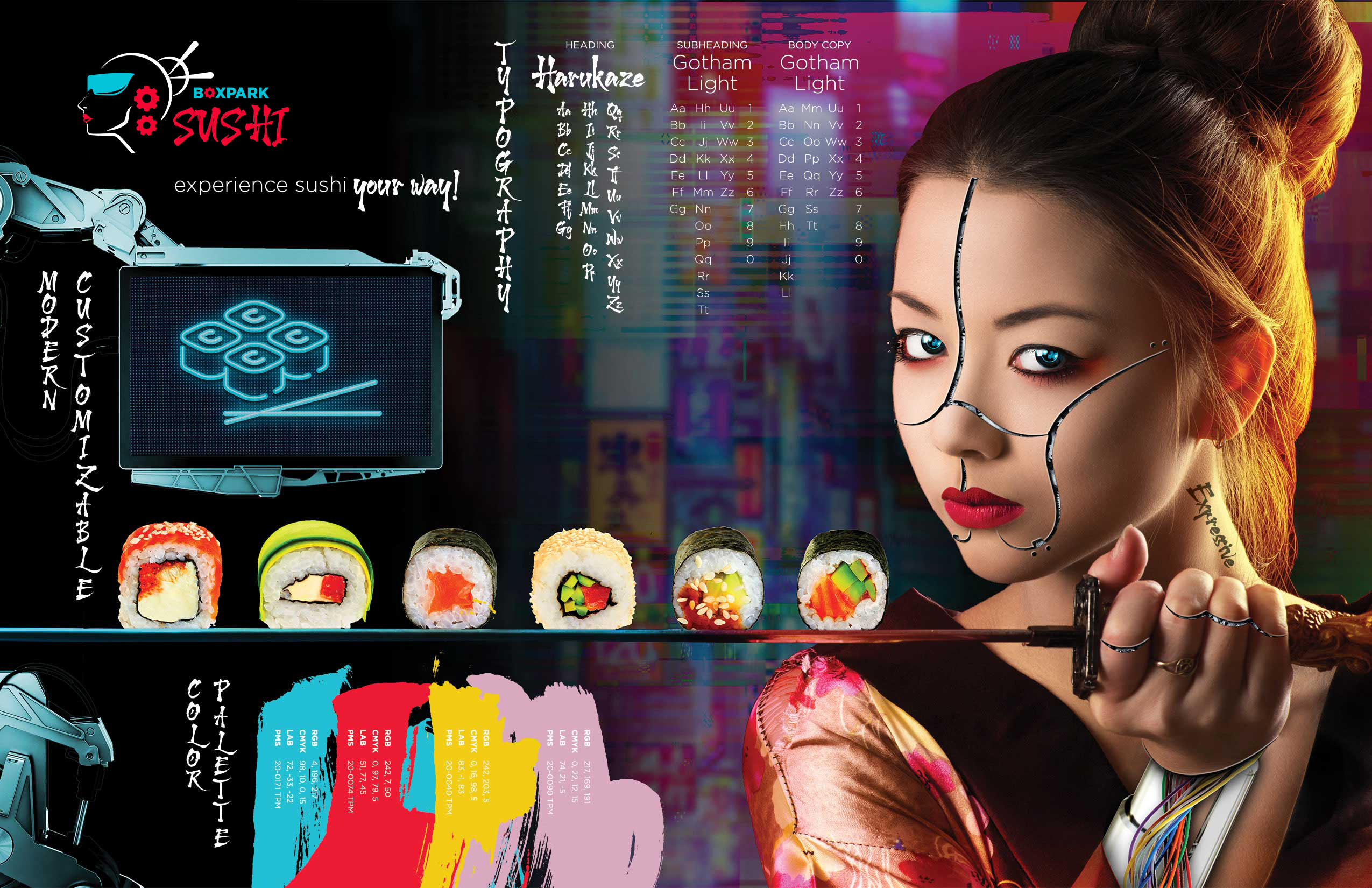
Once the logo for Boxpark Sushi was finalized, the next step was to flesh out the brand’s identity and overall vision. A static vision board was created to showcase the essential elements of the brand’s identity, including its mood, color palette, typography, and overall image treatment.
This vision board serves as a crucial tool for aligning all stakeholders on the brand’s direction, ensuring that all assets developed are consistent and on-message. By visually encapsulating the brand’s essence, the vision board facilitates a streamlined creative process, guiding the development of marketing materials and ensuring that every piece resonates with the intended identity and appeals to the target demographic. This cohesive approach lays a strong foundation for the brand’s future growth and recognition in the market.
Style Guide
Before any marketing assets were created, a comprehensive brand style guide was established to nurture and define Boxpark Sushi’s identity and boundaries. This guide outlines the dos and don’ts of brand representation, detailing how the brand’s voice and tone should be communicated across various platforms.
It includes specifications on logo usage, color palettes, typography, and imagery, ensuring a consistent and recognizable brand presence. Additionally, the style guide incorporates marketing strategies that will position Boxpark Sushi as a unique player in the Asian cuisine market. By providing clear guidelines, the brand style guide serves as a vital resource for maintaining coherence in all marketing efforts, reinforcing the brand’s identity and appealing to its target demographic effectively.
Marketing Strategies
Entrance Signage Lightbox
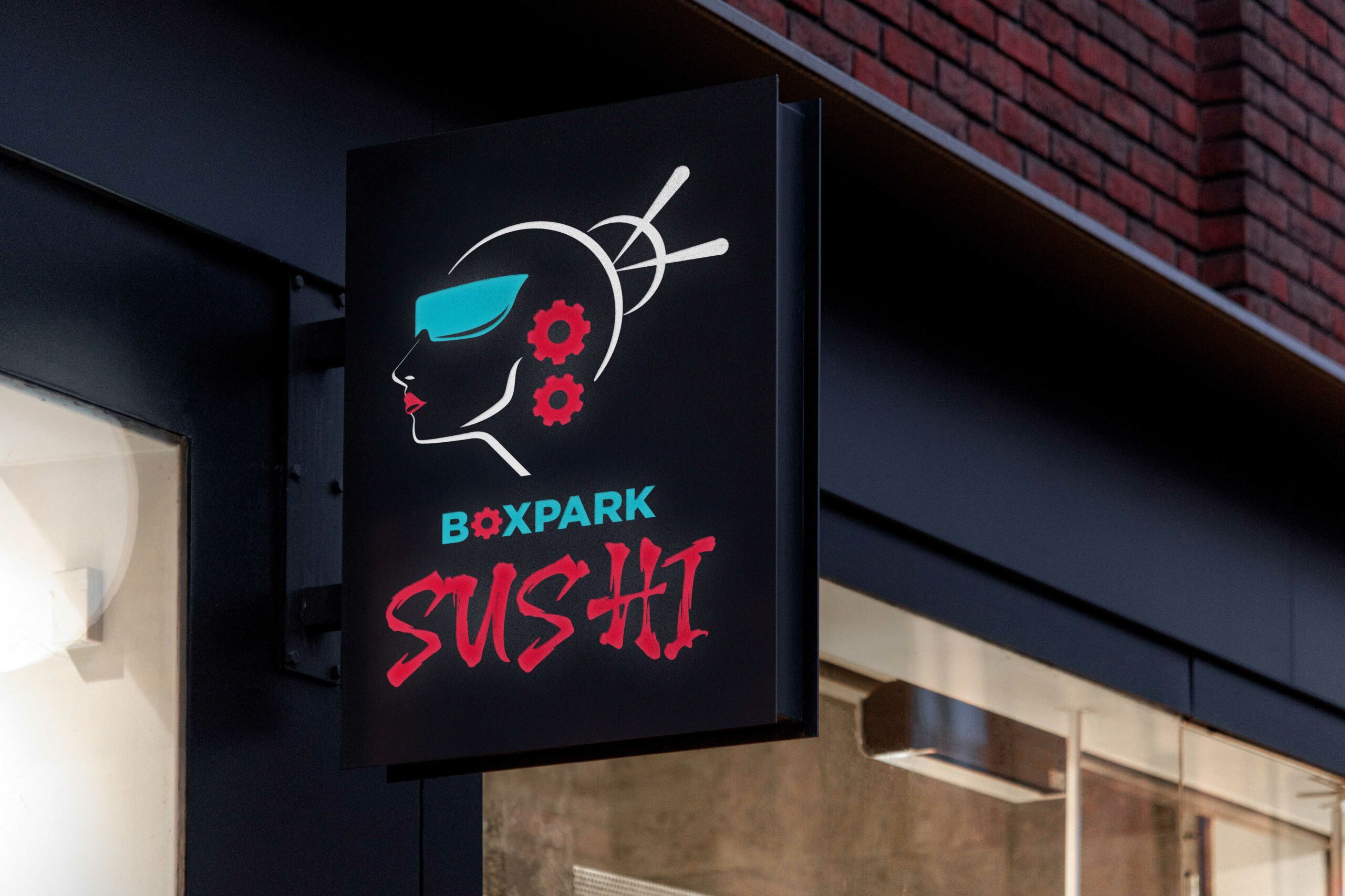
One of the first marketing strategies to implement innovation for Boxpark Sushi is the entrance sign, designed as a lightbox display. This signage enhances visibility, especially in low-light conditions, ensuring that the brand stands out in a crowded downtown area. The illuminated logo not only captures attention but also reinforces the modern, tech-savvy image of the restaurant, making it easily recognizable to potential customers as they approach. This strategic choice aligns with the overall branding goals, creating an inviting atmosphere while showcasing the unique identity of Boxpark Sushi.
Digital Outdoor Ad
Within the PR marketing strategy for Boxpark Sushi, the brand opted for digital outdoor signage instead of traditional static OOH advertising. This approach allows for more dynamic messaging, making it cost-effective to convey multiple promotions in a shorter timeframe while appealing to a diverse set of millennials. Given that millennials are often out enjoying nightlife and daytime activities, the engaging video advertisements effectively capture their attention, catering to their shorter attention spans and driving interest in the restaurant. This strategy not only enhances brand visibility but also aligns with Boxpark Sushi’s innovative and tech-savvy image.
Mobile App & Digital Tablet Menu
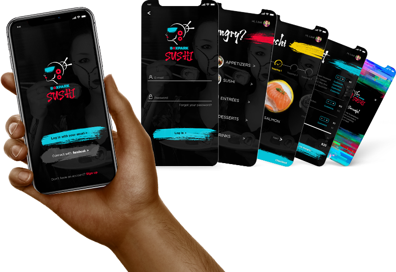
Within its targeted demographic, Boxpark Sushi employs innovative marketing strategies specifically aimed at millennials. Design decisions center on offering unique benefits and values tailored to this audience, such as customization options and interactive technology. This includes digital tablet menus for seamless ordering and a dedicated mobile app that enhances the overall dining experience. By prioritizing these features, Boxpark Sushi not only meets the preferences of tech-savvy millennials but also fosters a more engaging and personalized connection with its customers.
Brand Infographic
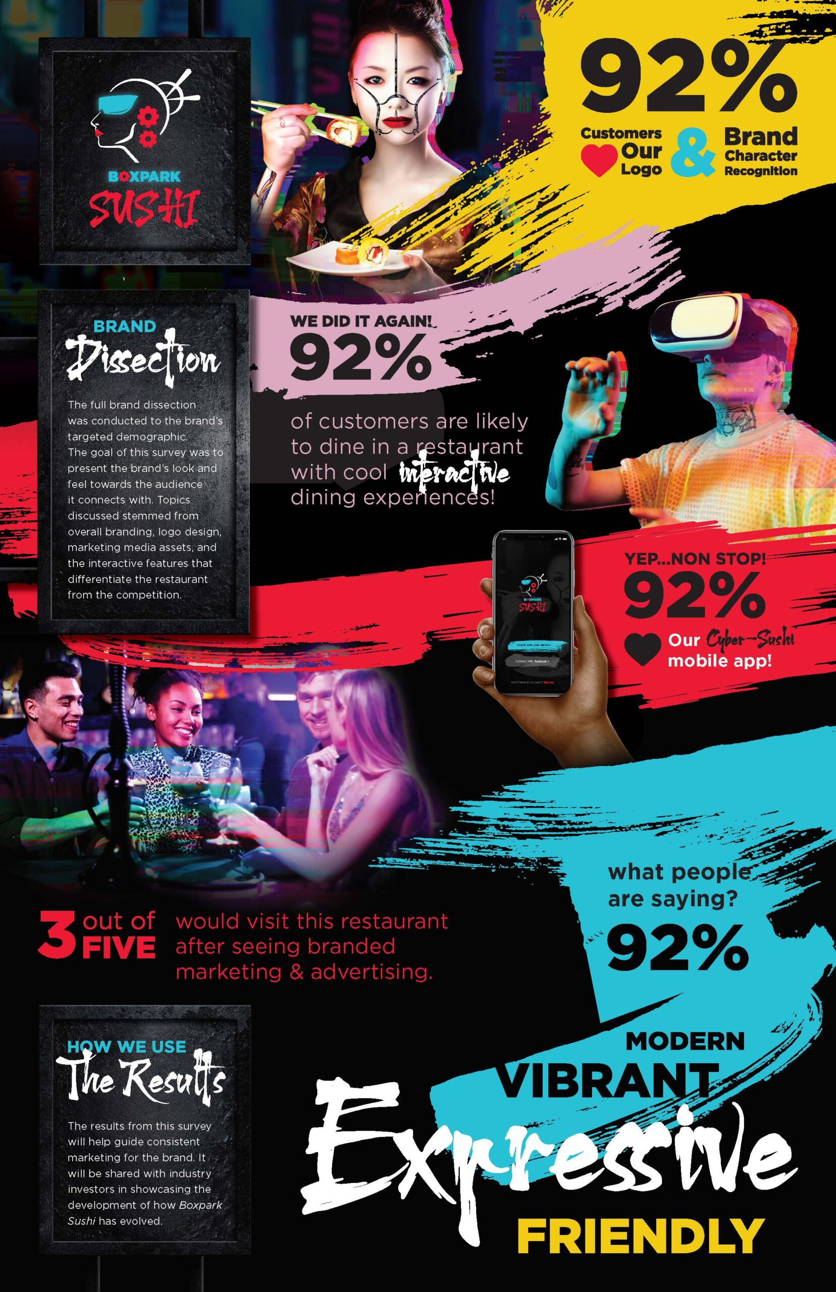
Overall, the design decisions for Boxpark Sushi effectively addressed the challenge of establishing a distinctive Asian cuisine restaurant aimed at young millennials. By conducting a branded survey, we evaluated the impact of our design choices and the technological features integrated into the brand. The survey results, gathered from the target demographic, confirmed the brand’s innovative approach and the success of its forward-thinking design strategy. This feedback not only validated our efforts but also highlighted the brand’s appeal and resonance within a competitive market.
